Amy's Ghost - Victim of the Mind
Tuesday, 26 February 2013
Monday, 25 February 2013
Sunday, 24 February 2013


Friday, 22 February 2013
Thursday, 21 February 2013
Question 3: Media Evaulation
What have
you learned from your audience feedback?
When we first started the process of
making a music video for a new artist, we had to consider the factor of
reaching out and connecting to our audience. As
our artist, Amy’s Ghost, has its own identity of their genre
of music; a mixture of alternative, singer/songwriter and a mellow
gothic sound, we wanted to try and capture the essence
of this across in our music video, connecting audio with visuals. This hopefully would be positive in our audience feedback.
Positive Audience Feedback:
“The concept of the
white and dark showing the different emotions coming together, is really
powerful”
“The lip-syncing is in
time for the majority of the music video”
“The fast-paced shots
of the actor in black is effective, it shows the thoughts in her mind which
links with the title of the song”
“I love the backwards
slow motion of the waterfall, that’s really good!”
“When the actor in
black slowly walks up the forest hill is one of my favourite shots. It’s really
effective, showing her being mesmerised by this vision in white”
Negative Audience Feedback:
“The moving waterfall image is
good, but would have been better if the frame didn't cut into black, before
moving onto the next frame”
We agree with this statement. In the filming
process we wanted to find different forms of transitions
for the music videos. Filming
the waterfall footage was one of my ideas. Once
uploading the footage on the Macs to Final Cut Pro, the footage
visually was really effective, creating a
mysterious atmosphere which links well with our artist.
Originally we were going to leave the waterfall footage as it was originally filmed.
However, after making our first draft cut, our
teachers thought the idea of positioning the waterfall
image into a photo frame would be effective. We
decided to take on their advice, positioning the
footage onto the photo frame, which is shown at
the beginning of the music video. We looked on Youtube
to see how the capture a moving image into a still frame,
which benefited us as a skill in this editing process. After
positioning the waterfall footage into the
correct place and lining up the other transitions
that we used (dissolve, cross-fade),
we formatted the footage
into video, too see the outcome.

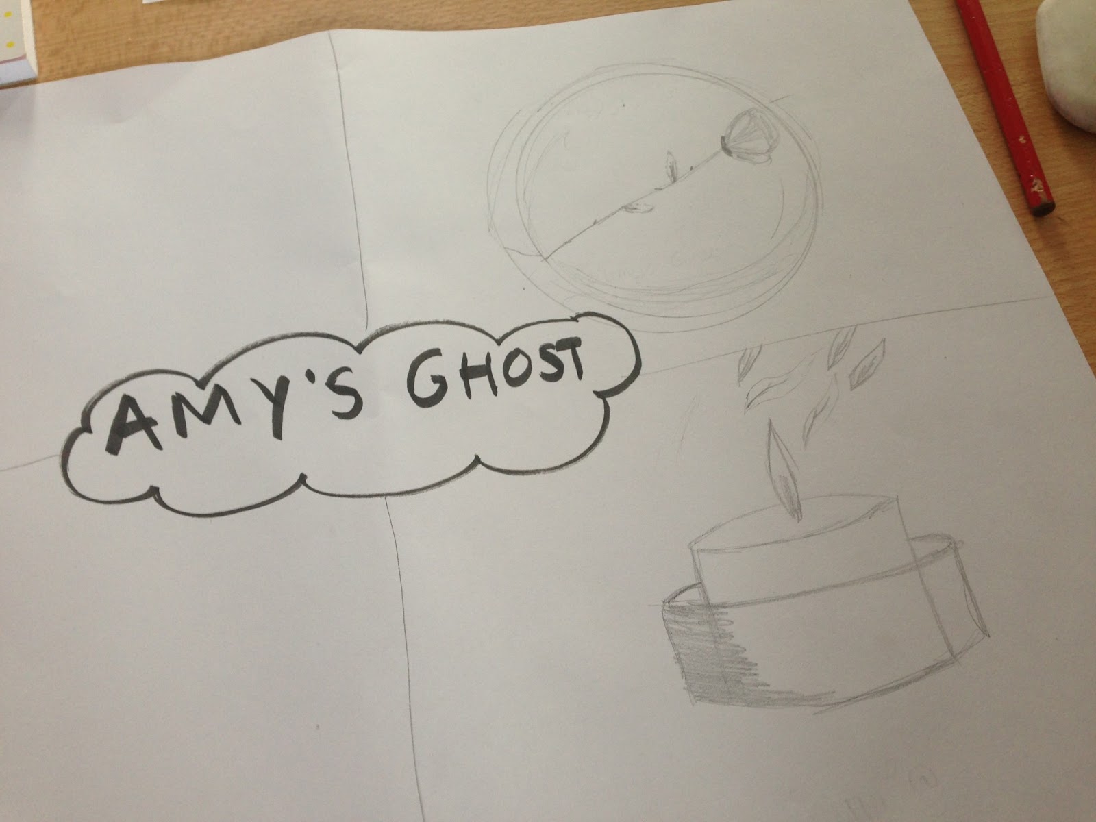
Waterfall Image:


What we thought the outcome would be, turned out to be a
problem, as it created a black frame around the dissolve transition that we used. We looked onto Youtube to find a solution to possibly change this,
however there was no information to video tutorial
to show us. We decided to leave the problem as it was, using fast-paced shots and multiple transitions
to hide the black frame. If we were to go back and change our music video, I
know we would leave the waterfall image as it were, as it still created a great effective on our music video.
“There isn’t a lot of shots of the artist singing, which kind of takes
away the aspect of the music video, and turns it into a film”
We disagree with this statement. We understood that the convention of a music video
includes close up shots of the artist singing; however we wanted to take a different
approach.
In music videos, artists often have some narrative
based storyline in their music video,
whilst others’ decide to include a narrative based
storyline throughout the majority of
their music videos; showing some to minimal shots
of the artist singing. Our artist, Amy Ghosts, let me and my partner Rebecca to have the freedom to be creative
in coming up with a narrative for the music video, as the single ‘Victim of the Mind’ hadn’t been released
yet from their new album. Although we had the freedom this narrative based music video, lead singer Amy, wanted
the plot line to involve a person being carried out
from her depression. Having an artist give us this amount of freedom to use the narrative to create the
artist plotline was thrilling, as we had many
ideas and ways of interpreting this.
In our storyboarding we
decided to include some footage of our artist singing, however not throughout, as we wanted
to portray our narrative based storyline. When filming, we took the time in filming good angles, close ups and
other variety of shots of Amy, which would not
only portray our bands identity through Amy’s eye make-up, but their style
of genre. For example, quick flashes of Amy herself in the woodland, to
show the mysterious concept of the song.

 -->
-->
We feel with the few but effective
close ups of our artist, it still classes
as a music video without the visuals of the artist. From our research and planning into music
videos, we found out that narrative based music
videos are becoming quite common. For
example, Justin Timberlake’s recent single ‘Mirrors’
is mainly narrative, and only at the end of the
music video does it feature him.
The main concept was to show a meaningful
storyline throughout a music video. We
don’t believe that a music
video has to always include the artist/band to make a good music
video, that audiences enjoy watching.
“The lighting was inconsistent”
This is a fair point. The lighting
used when we filmed the footage
in the house was inconsistent throughout, as we
used candles and some artificial
lighting to create an eerily atmosphere.

Similarly,
some of the end footage due to the bright sunlight made the footage
look as if we had Photo-shopped, even though we
hadn’t. This reflects on our protagonist Amy, dressed in white, the visuals
were too bright. We tried to turn some of the footage brightness up, in order to try and neutralise this in the film
however we couldn’t. Apart from this, the lighting in the woodland footage was perfect, as the lighting didn’t reflect brightly when uploaded to the Macs.

Overall, we are pleased with the feedback
received from our audience, as the majority of
the comments were positive.
The negative comments received were obvious pointers that we could see ourselves when submitting the final cut
of our music video, for example inconsistent lighting and the black
framing of around the moving waterfall image.
However, the comment of not a lot of close ups
of our artist we feel is unjust, but we have
justified our reasons behind this. Apart from this, we feel the actual core of the music video
was well made and a good success.
From receiving feedback on my music video I have learned a lot on the codes and conventions of music videos, for example close up of artists singing.
The main thing that I have learned is good research and
planning and good time keeping. I know
myself and my partner Rebecca went into great detail
for our research and planning, discovering articles of brand identity,
iconography, font style
researches and finding the means of what fonts connote, also researching into similar
artists, for example Lady Hawke, Fleet Foxes.
By going into great detail for our research,
it deepened our understanding
of our music video, helping us transform
our storyboard to visuals
on the screen. As we filmed our music video in
the beginning of September we could import the footage onto the Macs,
before deciding whether to re-film. Allowing
ourselves a lot of time to film, gave us the time to carefully select certain footage for our music video.
A good example would be the fast-pace
edits at the beginning of our music video,
showing our protagonist Jenny, who has depression. The fast-pace
edits shows Jenny’s thought process
around her, which links extremely well with the title of the song ‘Victim of the Mind’.
Wednesday, 20 February 2013
Question 4: Media Evaulation
How did you use new Media Technologies in the Construction, Research and Planning, and Evaluation stages?
http://prezi.com/tuhzfcacst0j/untitled-prezi/
Thursday, 14 February 2013
Ancillary: Finalising the Magazine Advert
After realising that our initial ideas would not meet the conventions of what we were creating we began to change our ideas starting with including the album design directly in to the advert. We then used an image from the video shoot and then added critic reviews, and tour dates however we thought that the woodland image would not be appropriate to the concept so we added the background that had been used in the album design and Digipak which we found to be far more appropriate as well as eye catching and so took as the final design.


Ancillary: Ideas of Magazine Advert
For an initial idea we began to take an image taken when on location and add some filters over the top and alter it to meet the conventions of adverts . So we re-sized the image and then added the key information. We then added different visuals and created three templates but soon realised that these templates did not meet the conventions and as there was a lot of relation to the music video there was no link to the album itself which meant that it didn't meet the conventions of a magazine advert as it does not sell the album only an aspect of the music video.


Wednesday, 13 February 2013
Ancillary: Final Decision on Album Cover

The reasoning behind this album artwork was to show the link in our music video, of the victim and the mind. To begin we looked at the main concept and message of the video, which is: a person battling through their depression to a point where they can begin to heal. The masks reflect this in our album artwork. Our album artwork shows multiple links from our music video.
Firstly, the symbolism of the rose reflects within our music video, showing the purity of Jenny as she finally comes out of her depression.
Secondly, we incorporated our own drawings and sketches for the the artwork. This is similar to Amy's Ghost, as she designs them herself by using sketches, water paints and her creativity.
We developed the sketch of the mask to create a outline would be later painted. We then tested several backgrounds and decided upon a three layered red background that is not only warm and somewhat comforting but also dark and the main connotation of blood.
We positioned each aspect from what we had decided to place in the album artwork and tested which one would best suit our artist and her images.
Ancillary: Album Artwork
When creating the ideas of our Album Artwork, we designed a number of album covers, before narrowing down our final choice.


Wednesday, 30 January 2013
Research and Planning: Typography for Ancillary
What is Typography?
1. Art techniques of font design.
2. Communicate meaning through font.
1. Art techniques of font design.
2. Communicate meaning through font.
In creating the album cover for Amy’s ghost it is essential that we study a wide range of typefaces and fonts in order to establish the correct one for Amy’s Ghost and us. Type faces helps to create the iconography that the group would want to create with their album artwork.
To begin we went back to basics and looked at how each letter is formed in order to establish what makes letters unique.
From my last blog post on Typography we have decided to change the top two fonts we could use.
Font 1:
Amy’s Ghost Victim of the Mind
Font 2:
Amy’s Ghost Victim of the Mind
Both these fonts create a somewhat antique aged look but where one is bold and sharp the other is soft and flowing. The two fonts would meet the direction the band is heading in terms of the aesthetic look, the final decision will be made and tested on the finished album artwork.
Sunday, 27 January 2013
Research and Planning: Ancillary of Amy's Ghost
After going through a creative process of the collages and looking at similar conventions in other artist's, we wrote down three things about our ancillary process.
1. Establishing iconography;
2. Meeting the genre conventions;
3. Establishing brand with the music video.
We had already successfully met question one and three in our ancillary process, however meeting the conventions of the genre for Amy's Ghost we haven't. Due to Amy's Ghost having a distinct sound which isn't around in the music industry yet, we can't decide on a genre for their music. Therefore we have to think carefully about our use of album work, in order for audiences/future audiences to recognise the band for their music. We came up with some ideas for their album artwork;


I believe the concept of the white rose would be a image as part of our ancillary. The rose is represented in our music video as a symbol of our protagonist leading our other protagonist out from depression, which meets the convention of establishing iconography. Secondly, the connotations of the white rose is purity, light, goodness, and innocence; which in some ways links to the nature mise-en-scene in our music video.
1. Establishing iconography;
2. Meeting the genre conventions;
3. Establishing brand with the music video.
We had already successfully met question one and three in our ancillary process, however meeting the conventions of the genre for Amy's Ghost we haven't. Due to Amy's Ghost having a distinct sound which isn't around in the music industry yet, we can't decide on a genre for their music. Therefore we have to think carefully about our use of album work, in order for audiences/future audiences to recognise the band for their music. We came up with some ideas for their album artwork;
Ideas 1 and 2:
Idea 3:

I believe the concept of the white rose would be a image as part of our ancillary. The rose is represented in our music video as a symbol of our protagonist leading our other protagonist out from depression, which meets the convention of establishing iconography. Secondly, the connotations of the white rose is purity, light, goodness, and innocence; which in some ways links to the nature mise-en-scene in our music video.
Research and Planning for Ancillary: Iconography and Branding
What is Iconography?
1. The use of study of images or symbols in visual arts.
2. The visual images, symbols, or modes of representation collectively associated with a person, cult, movement.
3. Own definition; Iconography is the use of images, symbols, slogans and colour's that have a distinct feature, which audiences recognise.
http://dictionary.reference.com/browse/iconography
What is Branding?
1. The process involved in creating a unique name and image for a product in the consumers' mind, mainly through advertising campaigns with a consistent theme.
2. Branding aims to establish a significant and differentiated presence in the market that attracts and retains loyal customers.
http://www.businessdictionary.com/definition/branding.html#ixzz2JArlAFGK
When looking at branding for Amy's Ghost, we created two collages'. One representing similar artists or bands that link with Amy's Ghosts concept, and the second one based mainly on the band. I look at the different albums, songs, band posters that shows our artist's existing branding.


By creating these collages I managed to establish conventions of similar artists. For example, Lady Hawke's water-colour's album artwork links extremely well with the majority of Amy's Ghost's albums, as they are hand drawn/painted. Secondly Florence and the Machine's Lungs album artwork links with Amy's Ghost. This is due to the interesting image used to attract audiences, which is what comes across in Amy's artwork. Thus, the iconic mystical eye-makeup Amy uses throughout all music videos and in some album work, creates enigma of who the band are/their style of music.
1. The use of study of images or symbols in visual arts.
2. The visual images, symbols, or modes of representation collectively associated with a person, cult, movement.
3. Own definition; Iconography is the use of images, symbols, slogans and colour's that have a distinct feature, which audiences recognise.
http://dictionary.reference.com/browse/iconography
What is Branding?
1. The process involved in creating a unique name and image for a product in the consumers' mind, mainly through advertising campaigns with a consistent theme.
2. Branding aims to establish a significant and differentiated presence in the market that attracts and retains loyal customers.
http://www.businessdictionary.com/definition/branding.html#ixzz2JArlAFGK
When looking at branding for Amy's Ghost, we created two collages'. One representing similar artists or bands that link with Amy's Ghosts concept, and the second one based mainly on the band. I look at the different albums, songs, band posters that shows our artist's existing branding.
Existing Artists'/Bands;

Amy's Ghost;

By creating these collages I managed to establish conventions of similar artists. For example, Lady Hawke's water-colour's album artwork links extremely well with the majority of Amy's Ghost's albums, as they are hand drawn/painted. Secondly Florence and the Machine's Lungs album artwork links with Amy's Ghost. This is due to the interesting image used to attract audiences, which is what comes across in Amy's artwork. Thus, the iconic mystical eye-makeup Amy uses throughout all music videos and in some album work, creates enigma of who the band are/their style of music.
Friday, 25 January 2013
Research and Planning for Ancillary
In our Media lesson today to help us with our Ancillary process, we were presented with several album artwork images, which we analysed to find the genre, reasons behind our suggestions of that genre and any ideas/details on the album artwork, that suggest the genre.


 Wretched and Divine


Haim

.jpg)

.jpg)
.jpg)
Lupe Fiasco

When first presented with this album artwork, I instantly knew that it is an R'n'B Genre. The reasoning behind this is the use of fashion and colour that is linked together. The colourful lighting bolt has connotations of the stars and galaxy, suggesting that his new album will be 'flying through the universe'. In addition to this, the artist himself being the central of the album is a similar trait in other R'n'B album work. For example;
Chris Brown
Rihanna
P Diddy
I believe the reasons behind the artist being the central of their artwork, is to show the power and the icon of their appearance so their audience know who they are.
Lamb of God

Our second album artwork presented was Lamb of God. Looking at this artwork I had an idea of heavy rock/metal music involved. This is due to the conventions of medieval/gothic fonts. The use of the Phoenix represent fire, flames, death, destructions. Apart from this, some Heavy metal bands use iconic images to hide themselves visually, however being accepted by their audiences vocally. This could be scremo, or dark lyrics. Examples of albums using images;
Stone Sour
Wretched and Divine
Iron Maiden
Haim

Instantly again I recognised the type of genre Haim have, which is popular. One of the iconic traits of girl bands or in this case a band of sisters. The similar trait of a black and white image reflects the 'hipster' fashion today, and the dominance of the female power by having the album cover as the artist. In addition to this, there is an inter-textual reference of Prince, Purple Rain font of the word "forever". Examples of black and white images of bands/artists and the dominance of female power;
The Saturdays
.jpg) Alesha Keys
Alesha Keys
.jpg)
The Saturdays
Alesha Keys
Wonder Girls


The Moons
.jpg)
Looking at The Moons album artwork, I said that they have an Alternative genre. The use of simplistic colours with one colour standing out, the ray-bands, represent an easy-going but connective music, which the audience can relate to. Similar to R'n'B artist, for Alternative genres the artist/band is represented to attract audiences attention, however this is not always the case. In some cases, artists use a symbolic icon or image in order for their audience to regonise them straight away, for example Alt-J. Other examples;
Symbolic Icons/Image; Alt-J

Symbolic Icons/Image; The Courteeners
Imagine Dragons;
Subscribe to:
Posts (Atom)